Colour and texture in garden planting: why flowers are not enough
Flowers give garden planting its most obvious moments, but they rarely last long enough to hold the whole scheme together. Once flowering passes, a border or raised bed depends on foliage, shape, height and repetition, which is why long-term planting matters when choosing what to plant in a raised bed that lasts.
That is why garden colour and texture need to be planned together. Colour brings energy and contrast. Texture gives the planting rhythm when flowers fade.
The aim is not to avoid flowers. It is to stop asking them to do all the work. A calmer planting scheme starts with structure, then uses colour as emphasis.
In raised bed planting, this matters even more. The bed lifts plants into view, creates a visible frame and makes height, spillover and foliage texture easier to notice.
Key takeaway: Flowers create impact, but texture carries the planting after flowering. Use one clear colour direction, repeat foliage forms, control bright colours, and plan height, middle texture and edge behaviour before choosing plants only for flower colour.
Flowers create impact, but texture holds garden planting together
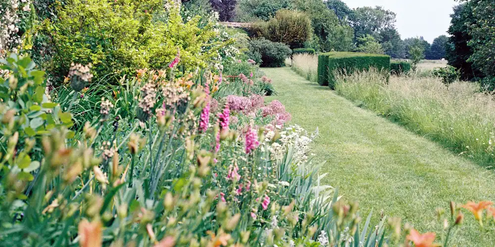
Flower colour is often the first thing people notice, but it is also the least reliable part of a planting scheme. Flowers appear, peak, fade and disappear. Texture stays present for longer.
Texture means leaf size, surface, density, habit and form. A plant with strong foliage still contributes when it is not flowering. A plant chosen only for colour can leave a gap once its main display is over.
Colour still matters. Its job is to lift the planting, mark seasonal moments and create contrast. Texture holds the scheme together when those moments pass.
| Element | Best role in garden planting | Risk if it does too much | Better judgement |
|---|---|---|---|
| Flower colour | Adds impact, contrast and seasonal energy. | The scheme can feel empty when flowering ends. | Use flowers as emphasis, not the whole structure. |
| Foliage colour | Provides longer-lasting colour through the growing season. | Too many foliage tones can look restless. | Repeat a small range of greens, silvers, burgundy or blue-green tones. |
| Foliage texture | Gives rhythm, mass and continuity after flowers fade. | Too many leaf shapes create visual noise. | Balance bold, medium and fine textures deliberately. |
| Plant form | Creates height, outline and structure. | Too many competing shapes weaken the scheme. | Repeat forms at different points in the planting. |
| Repetition | Helps the eye read the planting as one composition. | Too little repetition makes every plant compete. | Repeat one colour, texture, form or habit clearly. |
If flowers are emphasis rather than structure, the next question is which colours should do that job. Start with restraint: choose one clear colour direction, then use foliage and texture to make it last.
Garden colour schemes that still work after flowering
A good garden colour scheme is not just a set of flower colours. It has to work when flowers are open and still make sense when they fade.
Start with one dominant colour family. Purple and blue create depth. White and cream lighten. Yellow and orange add heat. Greens, silvers and burgundy foliage can carry colour for much longer than petals.
Most schemes go wrong by trying to include too much. A small garden, border or raised bed usually looks calmer when one colour direction leads and the others support it.
The table below shows how different garden colours behave in real planting.
| Colour choice | What it usually does | Best use in planting | Watch out for |
|---|---|---|---|
| White and cream | Lighten the planting and help link stronger colours. | Shade, evening views and calm schemes. | Can look stark without green, silver or soft texture. |
| Purple and blue | Create depth, coolness and visual calm. | Relaxed borders, herb planting and long-flowering schemes. | Can feel dull if every leaf texture is similar. |
| Pink and soft red | Add warmth without the force of hot colours. | Mixed borders, cottage-style planting and softer schemes. | Can become sugary if not grounded with green or darker foliage. |
| Yellow and orange | Bring heat, energy and strong attention. | Sunny beds, late-summer highlights and deliberate focal points. | Can dominate small spaces quickly. |
| Silver and grey foliage | Soften flower colour and add lasting brightness. | Drought-tolerant planting, herbs and Mediterranean-style schemes. | Can look flat without darker green contrast. |
| Dark green and burgundy foliage | Add depth, contrast and weight. | Design-led planting, pale flowers and strong foliage schemes. | Too much can feel heavy in shade. |
| Variegated foliage | Adds brightness without relying on flowers. | Small accents, shade and winter interest. | Too much can look busy or artificial. |
Choose one dominant colour family first
One leading colour family gives the planting identity. It does not need to be strict, but it should be clear. Once the main direction is set, supporting colours are easier to judge. They either soften, deepen or deliberately contrast.
Use bright colours as accents, not wallpaper
Strong yellow, orange, red and hot pink carry more visual weight than softer colours. Use them where you want attention, then give them quiet planting around them. In a small space, one repeated hot colour usually works better than several loud colours competing.
Use foliage colour as the long-lasting colour base
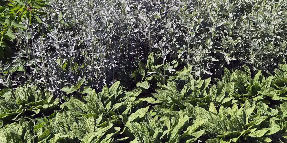
Foliage colour often lasts longer than flower colour. Silver herbs, blue-green grasses, burgundy leaves and deep evergreen structure can keep the scheme readable between flowering peaks.
This is where colour and texture begin to work together. The leaf is not just colour. Its size, surface and habit decide whether that colour feels soft, bold, heavy or calm.
Planting combinations that use colour and texture without visual chaos
Good planting combinations are built from roles, not just attractive plants. One plant gives height, another softens the edge, another brings seasonal colour, and another repeats a texture used elsewhere.
That is how garden colour and texture avoid chaos. Instead of every plant asking for attention, each plant has a job. Strong contrast can work, but without repeated foliage, shared colour or clear structure, contrast becomes noise.
| Combination pattern | Why it works | Example behaviour | Risk to avoid |
|---|---|---|---|
| Bold foliage with fine foliage | Creates contrast without relying on flower colour. | Large leaves hold attention while fine leaves soften the planting. | Too much contrast can feel restless if nothing repeats. |
| Upright plants with mounding plants | Adds height while keeping the base settled. | Vertical stems rise through a calmer layer of foliage. | Too many upright accents can make the planting look spiky. |
| Repeated foliage with brief flowers | Keeps the scheme coherent after flowering ends. | Flowers appear as seasonal punctuation rather than the main structure. | The display can feel flat if the repeated foliage lacks texture. |
| Muted structure with vivid accents | Lets strong colour feel deliberate rather than loud. | Bright flowers stand out because the surrounding planting is calmer. | Too many vivid accents can weaken the focal point. |
| Soft spillover with stronger centre planting | Links the planting to paths, gravel, lawn or paving. | Edges soften while the middle keeps shape and height. | Uncontrolled spillover can make the whole bed look untidy. |
Combine plants by job, not just by flower colour
Before choosing a plant for its flower, decide what the space needs: height, softness, evergreen structure, repeated foliage, seasonal colour or edge movement.
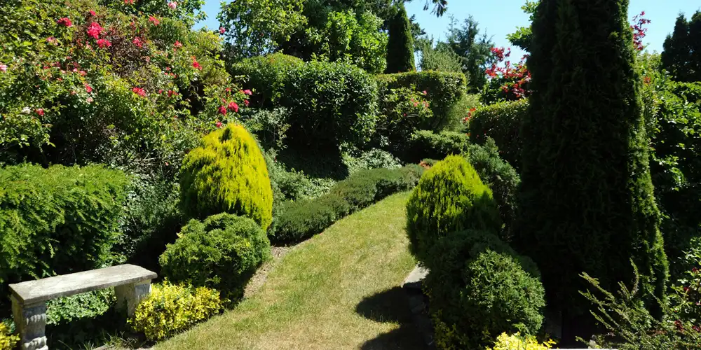
This prevents the common mistake of adding more colour when the real problem is lack of form. A busy scheme often does not need another flower. It needs clearer structure.
Repeat one feature across different plants
Repetition does not have to mean using the same plant everywhere. You can repeat a leaf shape, flower colour, upright habit, silver tone, fine texture or mounding form.
That small repeat gives the eye something to recognise. If the repeated feature is evergreen, such as clipped form, dark foliage or a consistent mounding habit, the thread can remain visible in winter.
Year-round garden structure: why foliage texture matters after flowers fade
Once flowering passes, the garden is carried by what remains: foliage texture, plant form, seedheads, grasses, evergreen structure and the way plants hold space.
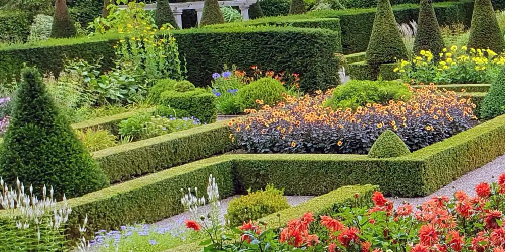
Flower-led planting often weakens here. If the non-flowering parts have not been considered, the garden can feel thin or unfinished for long periods.
A strong leaf can do as much visual work as a flower. Broad leaves create weight. Fine leaves add softness and movement. Glossy leaves catch light. Matte leaves recede.
Use bold, medium and fine textures deliberately
A planting scheme usually feels stronger when one texture leads and the others support it. Bold foliage gives the eye somewhere to rest. Medium foliage connects the scheme. Fine foliage softens edges and adds movement.
Avoid too many competing leaf shapes
A busy garden is not always too colourful. Often, it has too many unrelated leaf shapes. Texture works best when it repeats. One leaf shape can look accidental. Several related shapes become design.
How repetition improves garden planting without making it boring
Repetition is what turns separate plants into a scheme. It gives the eye something to recognise, which makes garden colour and texture feel deliberate rather than scattered.
The trick is to repeat a feature, not necessarily the same plant. You can repeat:
- a flower colour
- a leaf shape
- an upright habit
- a silver or blue-green tone
- a clipped form
- a soft spilling edge
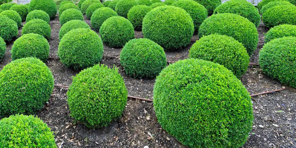
In a long border or row of raised beds, repeating a form every few steps creates a visual beat that helps the eye travel through the planting.
Repetition becomes boring only when nothing changes around it. Keep one thread consistent, then let height, season, flower shape or texture provide variation.
How to create year-round interest in garden planting without constant colour
Year-round interest does not mean year-round flowers. In most gardens, it comes from structure that still reads when colour is quiet.
Use foliage, seedheads, grasses, evergreen forms and plant outlines to carry the garden between flowering peaks. In winter, clipped shapes, persistent stems and fine grasses can still give a border or raised bed a visible framework.
Colour can then arrive in moments rather than being forced to perform all year. That makes the scheme calmer, easier to maintain and less dependent on constant replacement planting.
How to use height, texture and spillover in raised bed planting
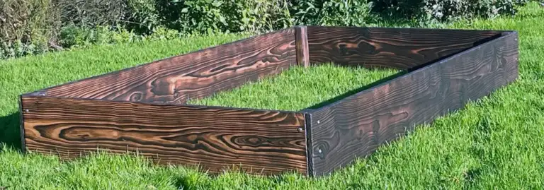
Raised bed planting needs a clear planting plan because the bed itself becomes part of the design. It lifts plants closer to eye level, creates a visible frame and makes the edge more important than it would be in a loose border.
The strongest raised bed layouts usually work in three layers: height above the bed, texture through the middle and controlled spillover at the edge.
| Raised bed layer | What it does visually | How to use it | Risk to avoid |
|---|---|---|---|
| Upright height | Stops the bed looking flat or tray-like. | Use grasses, upright perennials or clipped forms to create rhythm above the bed. | Too much height can make a small raised bed feel top-heavy. |
| Middle texture | Gives the planting body after flowers fade. | Repeat foliage shape, density or colour through the centre of the bed. | Too many unrelated textures can make the planting look messy. |
| Edge spillover | Softens the hard line between bed and path, gravel or lawn. | Use trailing, mounding or low plants where you want the edge to relax. | Too much spillover can hide the bed’s crafted frame. |
| Seasonal colour | Adds energy without carrying the whole scheme. | Use flowers as accents within a stronger foliage framework. | Colour alone can leave the bed bare or shapeless later. |
| Bed material | Changes how plant colours and textures read. | Use pale flowers, silver foliage or lime-green growth against dark timber or Yakisugi. Use softer greens, creams and purples with warm cedar tones. | A busy planting palette can fight the material instead of working with it. |
In timber raised beds, the frame is not neutral: the colour, height and surface of the wood affect how planting reads.
Use the raised bed frame as the starting point, then build the planting around it:
- Add height in repeated points, not as one isolated spike.
- Keep the middle layer strong enough to work after flowering.
- Let spillover soften selected edges, but do not hide the whole frame.
- Match colour strength to the material around it. Dark timber can take pale flowers, silver foliage and lime-green contrast. Warm cedar often sits better with greens, creams, soft purples and muted pinks.
- In narrow raised beds, use fewer plant types and repeat them more clearly.
Common colour and texture mistakes in garden planting
Most colour and texture problems come from asking the wrong element to do the wrong job. Watch for these:
- Using too many strong colours in one small space.
- Choosing flowers with no useful foliage after flowering.
- Mixing too many unrelated leaf shapes.
- Adding more colour when the real problem is lack of structure.
- Forgetting height, so the planting reads as one flat layer.
- Letting spillover hide a raised bed frame instead of softening it.
- Judging the scheme too early, before repetition and texture have settled.
A simple colour and texture checklist for garden planting
Before planting, check the scheme without imagining it in full flower:
- Is there one clear colour direction?
- Does at least one foliage texture repeat?
- Will the planting still work after flowering?
- Are bright colours used deliberately?
- Is there height, middle texture and edge behaviour?
- Does the scheme suit the background, path, paving or raised bed material?
- Can the planting stay coherent with normal maintenance, not constant correction?
Flowers start the garden display, texture keeps it working
Flowers are valuable, but they are not enough to carry a planting scheme alone. The strongest garden colour and texture comes from using flowers as emphasis, foliage as structure and repetition as the thread that holds everything together.
Plan what remains after flowering, and the garden will feel calmer, fuller and more deliberate for longer.